Learning to work with InDesign has been a rocky but rewarding experience, and I’m both surprised by and proud of how just a few simple tricks can make a spread look so much better than a simple word document!
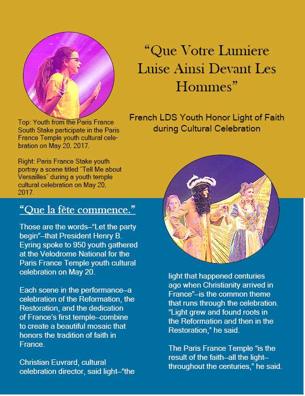
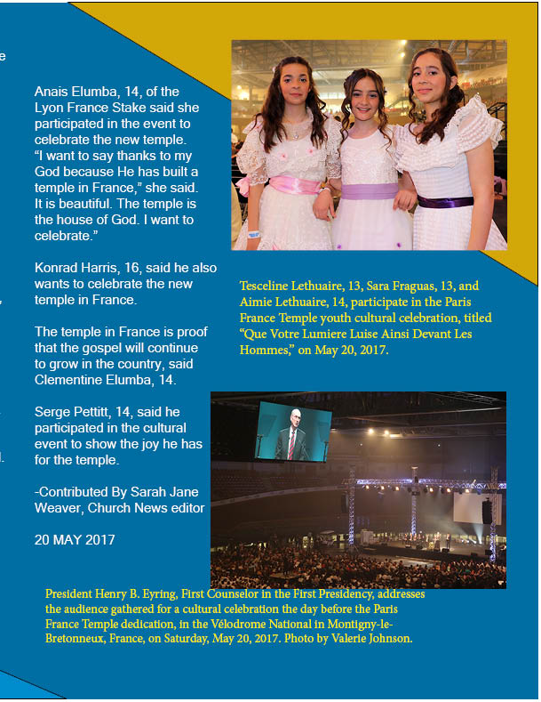
I did my spread on this interesting story about the youth cultural celebration at the dedication of the new Paris, France temple, and tried to make the colors and layout of the pages match the “Festive” yet reverent theme with a mix of yellows and blues. I also attempted to select photographs of the event that showed off the colors, diversity, and sense of scale presented by the event.
The Spread
Here is my finished spread… In retrospect, I would have liked to clean up the text boxes used for the labels and pull-out quote, but otherwise this might be the most elaborate and least crowded-looking piece I’ve ever done!
For my contrasting typography, I used Baskerville Oldface (an Oldstyle font) for the title, headings, and pull-out quote, and Microsoft Sans Serif for the remainder of the text.
The following images were used:


All these images can be attributed to Sarah Jane Weaver, and can be found here.
Target Audience
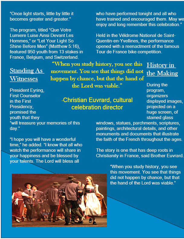
Since this was a story about youth showing their devotion, I decided to make this piece appeal to youth. I tried to keep the design lively, but still easy to follow; fun, but not distracting. So, I selected pictures that showed off the youth showcasing thier talents and having fun! I also tried to use the background to my advantage, with lines that emphasized the way the text flowed, colors and shapes positioned so that they highlighted pictures and quotes, offsetting the title, and putting the photos on the first page into circles, rather than leaving them in their standard shape. This last idea is one I’m particularly proud of, since I thought it would be fun to make them look like baloons at a party!
Use of Design
In addition to the considerations listed above, I wanted to evoke certain feelings with the colors… A yellow that is awake and remeniscient of light, the theme of the youth festival, and a blue that sets a tone of reverence. I used a brighter yellow to make the pull-out quote and captions pop, as well as differentiating them from the main text and carrying on the “light” theme.
I picked Baskerville Oldface for the heading text to give it a more “french” feel, and Microsoft Sans Serif for a bit of contrast that was still easy on the eyes!
